

Free Nautical iPhone Wallpapers

If you follow me on Instagram, you know I'm a huge sucker for a good lake photo (or ocean, or sea, or anything I can dive into, really) and marrying them up with quotes from my favorite rock 'n' rollers. SO, I hand lettered some of them for your own personal iPhone enjoyment. I struggle to find wallpapers that I love, so I made these for fun and hope you'll enjoy them too! Just click on the image you'd like and download from there. Enjoy!
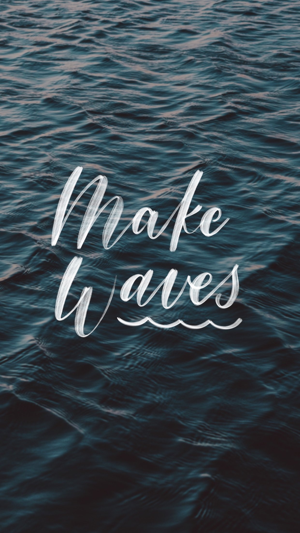
CLICK IMAGE TO DOWNLOAD
MAKE WAVES WALLPAPER

CLICK IMAGE TO DOWNLOAD
VAN MORRISON WALLPAPER

CLICK IMAGE TO DOWNLOAD
TOM PETTY WALLPAPER

Shore Society for Sapphire Pear | Holiday Edition
I teamed up with Sapphire Pear again on a tea towel collection – this time, for the holiday season. Being the color lovers they are, we went with a bright palette and included some eye-catching patterns and phrases. I love the charming little ski scene too!
They're available exclusively at Sapphire Pear, so be sure to stop in before they're gone for good. You might also find a few things you'll want to take home (their throw pillows = adorable) so consider yourself warned!


Shore Society for Sapphire Pear

The ladies of Sapphire Pear and I recently linked up to create a range of products, and I'm so excited for the launch! I designed a variety of tea towels and coaster sets just for them, that will be perfect for sprucing up your kitchen or bar cart.
Their shop and studio in Rocky River is full of tantalizing color combinations and furnishings, and I was really inspired by their space when I began designing. There are a range of hand-drawn patterns, which of course had to include some nautical subjects. We worked together to develop the color palette, which reflects their punchy design aesthetic.
All of the pieces are available exclusively at Sapphire Pear, so be sure to stop in or give the ladies a call to get your own!


Library Themed Baby Shower Invites

Happy Monday, everyone! We made it to the other side of Daylight Savings. How awesome is that? I don't even mind losing an hour of sleep when it means that sunnier days are ahead!
We started our massive kitchen remodel this weekend (story for another blog post – coming soon), but today I'm here to share these baby shower invitations I recently finished.
My client wanted something sophisticated and gender neutral to fit her library themed shower, and I'm so happy with how they turned out. We chose not to use any literal "library" iconography, and instead used the format to telegraph the theme. I used a manila pocket to hold the library-card styled invitation, as well as a bookplate label for guests to fill out with a message for baby. The bookplates will then be placed into the books that will fill the little one's library. Such a sweet idea that I'm sure he or she will treasure when they're older!
I also designed a matching Thank You card, making it a fully customized suite. Big congrats to this lovely couple on their baby-to-be!


Shore Society | New Look
I launched the new SS site last week and wanted to share some of the inspiration that went into the new look and branding. As any designer will tell you, designing for yourself is sort of a torturous process—you're trying to balance your vision with all of the possibilities, and nothing ever seems to be finished. You'll tweak everything over and over until you've lost the message, so knowing when to STOP noodling is key.

I began the process by collecting some inspirational images that spoke to me through texture, color, pattern and mood, and matched the aesthetic direction that felt right for Shore Society. I wanted the look to be true to the brand's nautical roots, but to avoid appearing clean and preppy – the local Cleveland influence required something a little more textured and timeworn. Something more akin to iron ore ships than sailboats and Sperrys. The overall look developed into a mix of modern and cottage, which stayed true to my own tastes as well as the existing feel of the brand.
Most of the inspiration I drew from had a limited color palette of warm black and bone ivory, with washes of gray-blue, drawn from the sea. Small doses of nude/shell peach gives a dose of femininity to such a neutral palette.
Developing the logo took the most time, by far. I went through countless ideas and revisions (should be hand lettered? Type? Clean, rough, sweet, or whimsical?) and those were all approaches I considered. In the end, I fell in love with this perfectly hand-done typeface that ticked all the boxes on my list. I expanded the design into my business cards, order insert, stickers, and packaging and hope that all of these elements create a gift-quality experience for my customers.


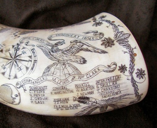
The "white" on all of my print pieces is actually a tint of the shale gray in my palette, to provide a warmer, scrimshaw-inspired tone.


My favorite purchase so far has to be this striped tissue paper for wrapping my shirts—it's so cute and makes me happy when I'm packing orders!
All of my printing was done by StationeryHQ and they did an awesome (and fast) job with each of the pieces. In the future I would also love to see have the business cards letterpressed. Completing the rebrand and website was a major task on this year's to-do list, and I'm so happy to check it off and move on to other things (like planning our wedding...oops). You can continue to follow the blog here, but I am hoping to move it over to shoresociety.com to keep everything in one place. Hang in there if you notice anything is missing or not working – I'm on it!
Illustrated Wedding Invitation for Meghan + Nate


Free Printable Valentines


Toothakers Wedding Print

Recently, I had the pleasure of creating a custom print for the lovely Kayla Coleman's wedding. She wanted a fun tooth print for their guests to sign as they united as the Toothakers—isn't that so cute? We incorporated their wedding colors into the print and left the tooth blank for signatures.
Kayla wanted the print to be the first thing guests see when they enter their home, and recently shared this photo with me of the final result. The frame she chose is beautiful and I love this cute vignette in their home! The print was printed and framed by Canvas on Demand, and the photo is credited to Kayla, who is an amazing photographer herself.
Thank you, Kayla, for giving me the opportunity to create something special for you! I love hearing how couples are adding personalized touches to their weddings. What are some of the cutest things you've seen lately?
Happy Halloween

Happy Halloween everyone! I'm looking forward to a night of hard cider and Trick-or-Treating at the house. All of our neighbors come out and I love seeing all of the kids' cute costumes. I seriously look forward to Halloween all year! I'm a dork.
Hope you all have something fun planned, or at least have some treats to enjoy tonight. I've been eating so much candy corn lately that it's showing up in my doodles—so I went ahead and channeled my craving into this pattern.
Happy haunting!
iPhoneography: 5 Favorite Photo Apps
It's no secret: I love me some Instagram. It's perfect for sharing those memorable moments when the closest camera is our trusty iPhone. I also love following my favorite bloggers, musicians, and style icons to get a sneak peek into their everyday lives. It all feels very off-the-cuff and exclusive, and it's fun to see everyday shots you would otherwise never see.
When if comes to sharing my own photos, the only beef I have with Instagram is that the filters are terrible.
There are really no other tools (besides the tilt-shift and "enhance" buttons) to help you make any adjustments, so you're left to do a little pre-work before. Now, I know what you're all thinking—this is supposed to be "instant" and of-the-moment, and you shouldn't overthink this. And for most of us, you're totally right. You can put up your photo with no filter, or filter it...who cares. But there is a camp of visually-obsessive people out there who want to give a good shot the attention it deserves, so this post is for you.
This is especially true if you're a blogger, creative professional, or business owner who relies on social media to establish a brand or grow your network. It's true that image is {almost} everything.
In my opinion, the extra steps are totally worth the result and don't take much time. And the editing apps are great for more than sharing purposes—if you ever send your photos to print directly from your phone, these will add the final touches.
There are hundreds of iPhone photo editing apps out there, but these are five of my favorite and most-used (and range from free to $1.99).
AFTERLIGHT ($0.99)
Useful features:
- Can adjust brightness, exposure, contrast, temperature, highlight/shadow color, and more in great detail. This is probably my most commonly used photo editing tool, because of its versatility and range of functions.
- Nice built-in filters, which are all adjustable
- Crop, rotate, add borders

The bottom panel contains the master navigation, and the buttons on top are your options within that set. Shown here are the slider adjustments for brightness, exposure, contrast, etc.

VSCO CAM (free)
Useful features:
- Can adjust brightness, exposure, contrast, temperature with simple interface
- Limited (but nice) built-in filters, which are all adjustable
- Crop + rotate tools

A glimpse at the filters—there are only 8 or so, but they keep the interface simple.

A slider bar allows you to control how strong you'd like the filter to be.

Simple adjustment options: brightness, temperature, contrast, rotate and crop.
CAMERA+ ($1.99)
Useful features:
- A collection photo-enhancing presets that provide a more natural look than standard filters—these are great for when you already have a great shot, and want to preserve the color or other elements of your photo.
- Wide range of filters and effects, if you're looking for a more highly-edited look
- Crop, rotate, add borders
- Adjustable self-timer—clutch!

PIC FX ($1.99)
Useful features:
- Wide range of filters and effects—including textures, light filters, and bokeh arranged in "album" sets to keep things organized
- Crop, rotate, add borders
- Can layer multiple effects on top of each other


PICLAY ($0.99)
Useful features:
- This app is funky and gives a highly-edited output. It has two basic functions: Overlay and Mirror. Mirror is self-explanatory; Overlay allows you to select two photos to make a composite shot. The two layers are adjustable, and you can apply effects to change the look of the overlay.
- Can layer pre-set light effects and textures over your image

Mirror Mode:
You can use this bottom row of buttons to add different types of lighting and texture enhancements.

Overlay Mode: Adjust the look of your overlay with a few pre-set filters.
There are a few other photo apps that I use sparingly, but these are my favorites. Do you guys pre-edit your photos before Instagramming? What apps do you like?