
Shore Society | New Look
I launched the new SS site last week and wanted to share some of the inspiration that went into the new look and branding. As any designer will tell you, designing for yourself is sort of a torturous process—you're trying to balance your vision with all of the possibilities, and nothing ever seems to be finished. You'll tweak everything over and over until you've lost the message, so knowing when to STOP noodling is key.

I began the process by collecting some inspirational images that spoke to me through texture, color, pattern and mood, and matched the aesthetic direction that felt right for Shore Society. I wanted the look to be true to the brand's nautical roots, but to avoid appearing clean and preppy – the local Cleveland influence required something a little more textured and timeworn. Something more akin to iron ore ships than sailboats and Sperrys. The overall look developed into a mix of modern and cottage, which stayed true to my own tastes as well as the existing feel of the brand.
Most of the inspiration I drew from had a limited color palette of warm black and bone ivory, with washes of gray-blue, drawn from the sea. Small doses of nude/shell peach gives a dose of femininity to such a neutral palette.
Developing the logo took the most time, by far. I went through countless ideas and revisions (should be hand lettered? Type? Clean, rough, sweet, or whimsical?) and those were all approaches I considered. In the end, I fell in love with this perfectly hand-done typeface that ticked all the boxes on my list. I expanded the design into my business cards, order insert, stickers, and packaging and hope that all of these elements create a gift-quality experience for my customers.


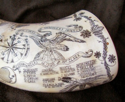
The "white" on all of my print pieces is actually a tint of the shale gray in my palette, to provide a warmer, scrimshaw-inspired tone.


My favorite purchase so far has to be this striped tissue paper for wrapping my shirts—it's so cute and makes me happy when I'm packing orders!
All of my printing was done by StationeryHQ and they did an awesome (and fast) job with each of the pieces. In the future I would also love to see have the business cards letterpressed. Completing the rebrand and website was a major task on this year's to-do list, and I'm so happy to check it off and move on to other things (like planning our wedding...oops). You can continue to follow the blog here, but I am hoping to move it over to shoresociety.com to keep everything in one place. Hang in there if you notice anything is missing or not working – I'm on it!