Home Series: Primary Bathroom
This time last year, we were starting to plan our bathroom remodel — pouring over catalogs, pricing things out, and making countless mockups (a necessity for my design brain!). I touched on the process a bit in my last post, but just have to share the dramatic before and afters with you!
We started demo in March, and the whole process took about 8 weeks to complete. It felt every bit of 8 weeks — we only have one full bath in the house, so we had to set up a temporary shower in the basement (it was as lovely as you’re imagining, haha). This is probably why the bathroom hadn’t been touched in decades — but we knew it would be worth the temporary disruption!
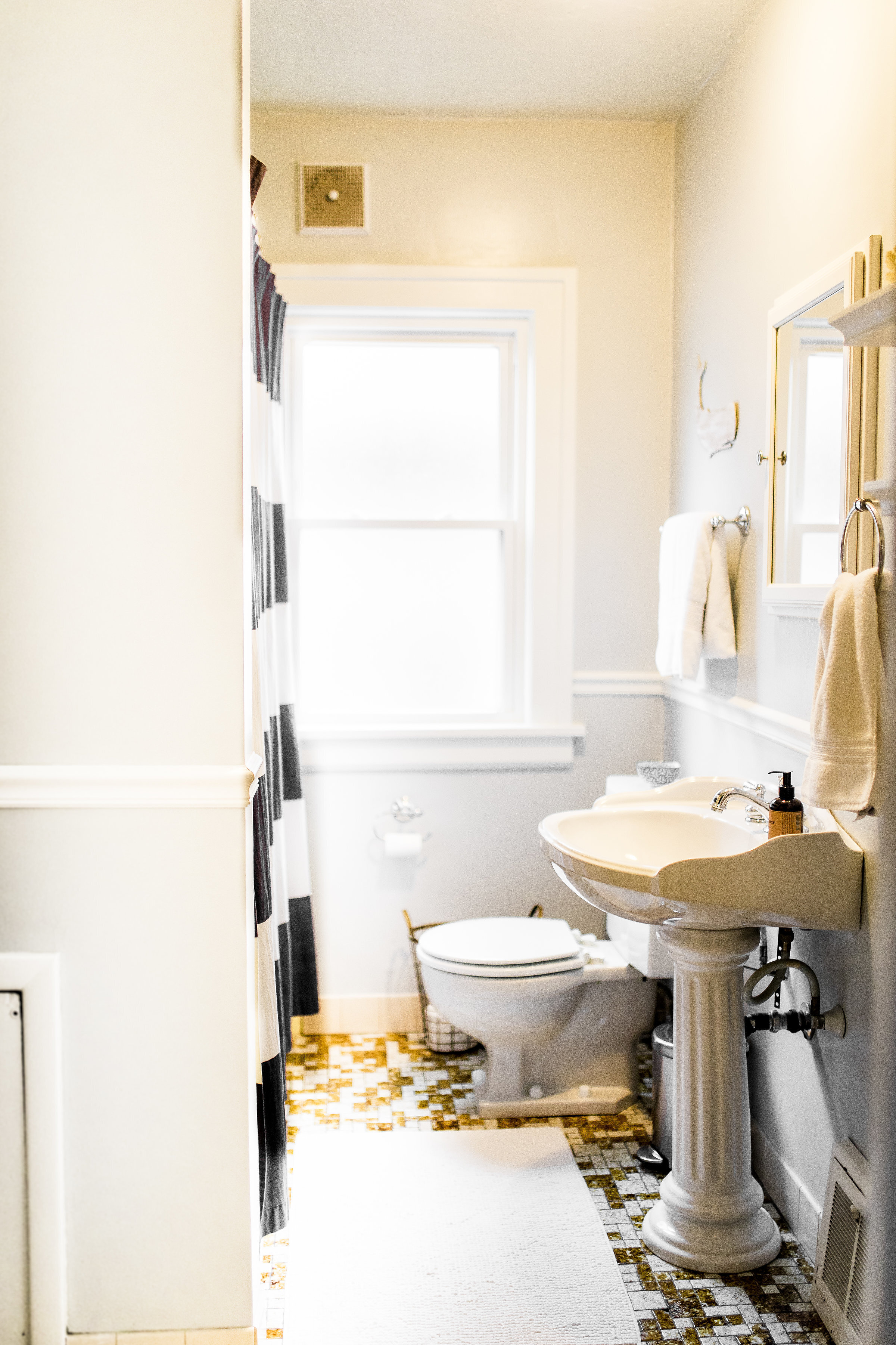
The layout of the bathroom was pretty awkward — the tub was situated long-ways on the wall, with the sink and toilet on the opposite, creating a totally cramped situation, and wasted dead space on the tub wall. The bathroom lacked storage as well, with only a pedestal sink and no closet or shelving. Did I also mention yellow tile? Yikes.
To open up the space, we knew we’d have to move the location of the tub/shower — and while we wrestled with the idea of putting in on the window wall, it was really the only option. Most of the Lakewood apartments I’ve lived in have had windows in the shower, and truthfully I like the natural light and airflow it provides — and we weren’t overly concerned with privacy since the window was already frosted.
Jim’s dad was instrumental in helping us draw up the plans and make use of the limited space we had. This project definitely felt more daunting than the kitchen, because the space was so much smaller and truthfully I knew NOTHING about bathrooms. I spent so many hours researching the pros and cons of cast iron tubs and when to seal marble tile and is brass too trendy for fixtures? (the answer is no). I honestly thought my head was going to fall off. However, we always want to do it RIGHT and make sure the materials and choices we make will hold up for years to come.
Let’s get to the photos — all by Kayla Coleman Photography!
BEFORE:
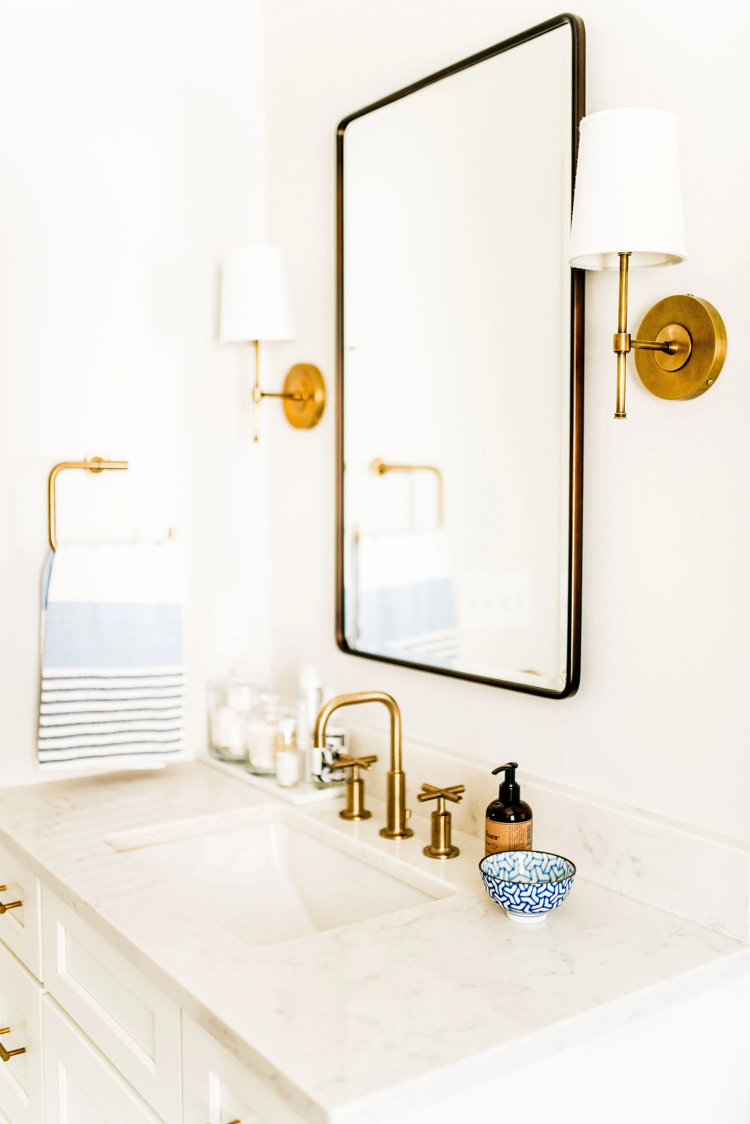
AFTER:
It’s hard to truly capture everything we did — from all-new electrical (more than one outlet, yay!) to new lighting to moving most of the plumbing — all while working around the existing limitations of our old house. To create full access to the space, we also moved the doorway over by about a foot, and changed the swing of it to lay flat along the wall. One of the classic century home elements we kept: our laundry chute, of course! The access door used to be down along the baseboard, so while the walls were open we raised the chute up to waist-height. It’s much easier to reach, but somehow still isn’t helping Jim to actually PUT his socks down it ;)
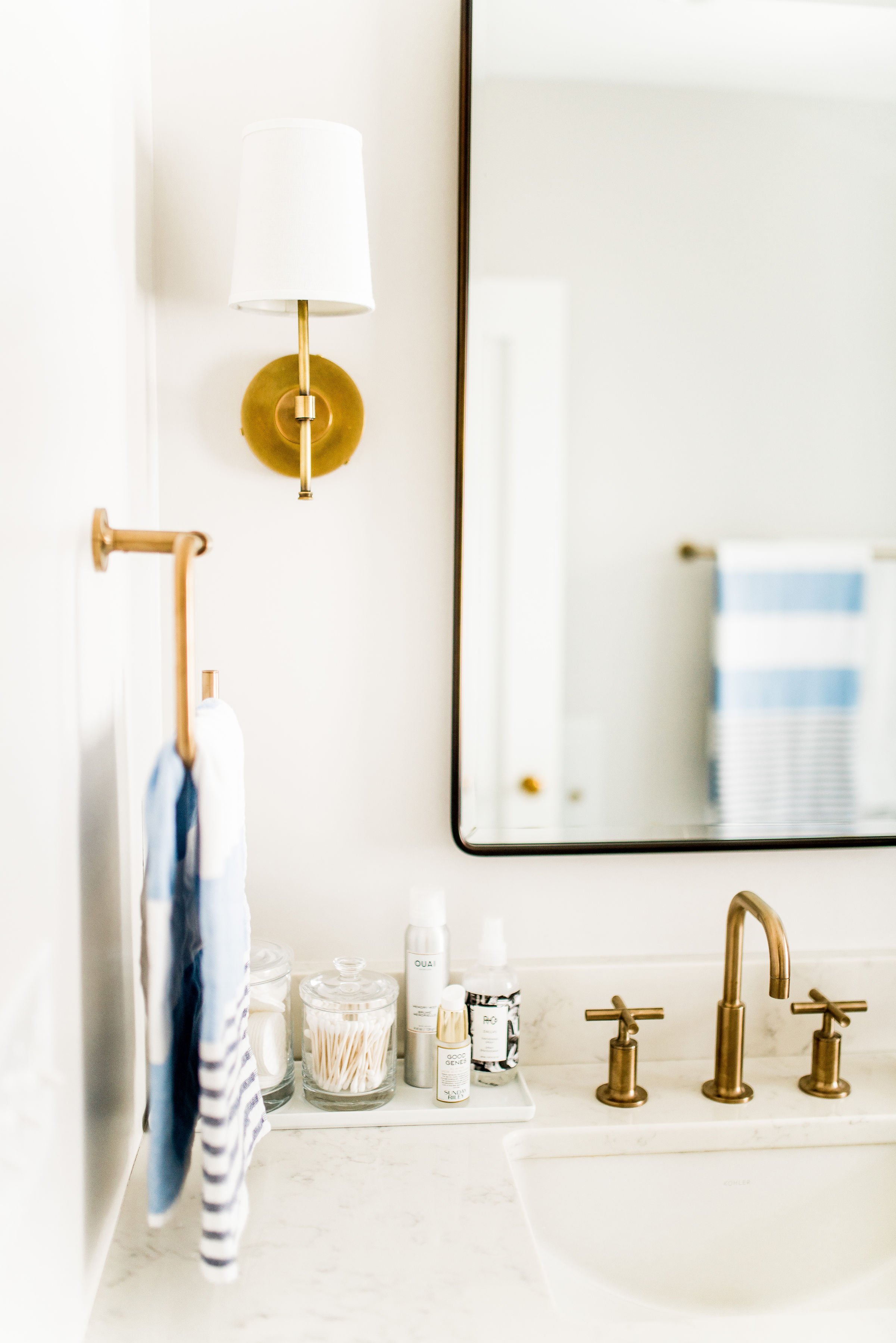
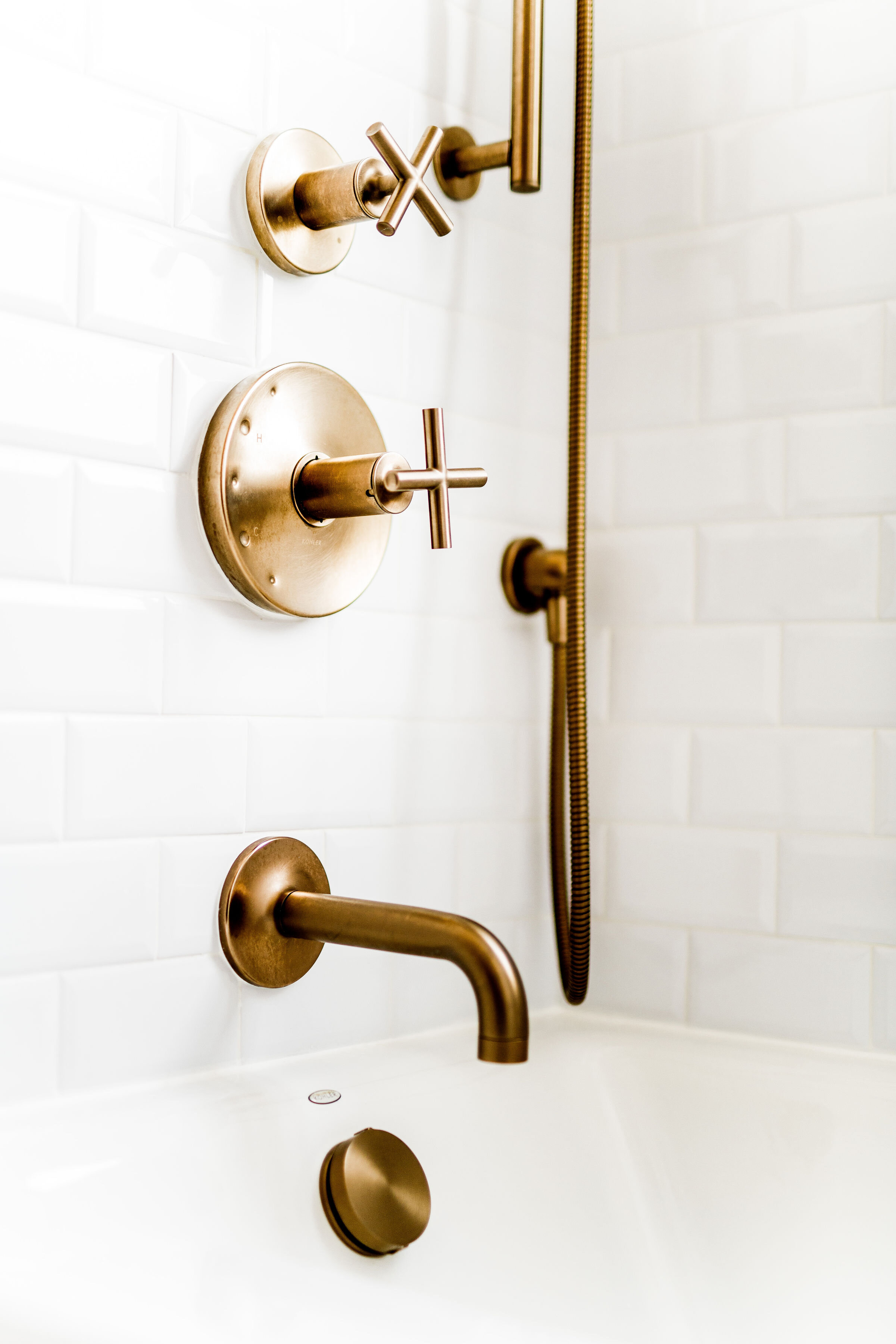
We are THRILLED with how it turned out, and with the design choices we made! We wanted a bright and airy space that suited the rest of the house, and that would feel updated yet classic. Choosing the Kohler Purist line in vibrant brushed bronze for our faucet/shower definitely added a clean, minimal feel while also being the showstopper of the bathroom. It’s not brassy at all in person, it’s a lovely warm metal that just totally pops in the space. I LOVE the x-handles and we’re so glad we sprung for a handheld sprayer as well — it’s super handy for dog baths, cleaning, quick showers, watering plants, etc.
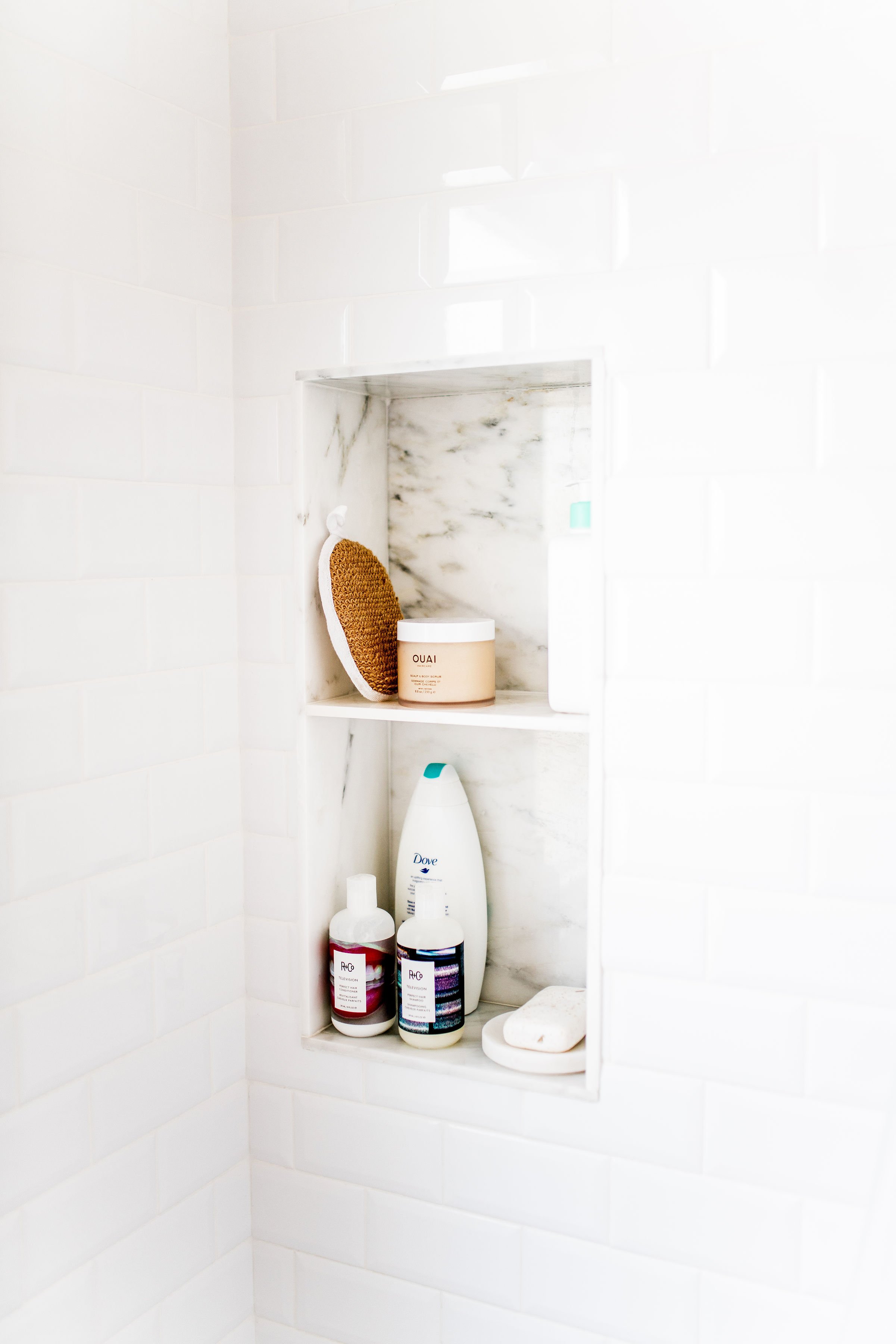
We both really loved the custom look of a drop-in tub with a tiled apron, and got the look with the Kohler Highbridge (which is actually an alcove tub). We went with beveled subway tile to add dimension, with Carrara marble accents for the windowsill, recess box, and edges. We love how it tied the shower in with the marble hexagons for the floor, without going overboard.
Jim’s dad had the genius idea of the floating shelves on the tub wall, to maximize that leftover space. It feels so custom and spa-like, we get compliments on those shelves all the time! The shelves also slide out (they’re on pegs) and allow us access to the shower plumbing, should there ever be an issue.
Just as life-changing: the vanity! Omg, after 6 years with a pedestal sink, you have no idea how excited we were about this storage. I love the look of pedestals, but with this being our only master, a vanity cabinet was our best bet. We have even more storage in the medicine cabinet (which is HUGE!) and I love that it just appears to be a mirror. It’s so seamless on the wall and we love the extra space!
Hope you guys enjoyed the tour of our remodel! This was such a huge project and we’re still so obsessed with it. It’s a little bittersweet though, knowing it was our last interior remodel — but you know us, I’m sure we’ll be tearing something up again soon ;) Sources are all linked below, but feel free to comment or email if you’re looking for anything specific. Thanks for reading!
SOURCES:
Tub | Faucet + Fixtures | Towel Bars | Sink | Medicine Cabinet | Sconces | Bath Towels | Bath Mat | Wood Stool | Shower Curtain | Cabinet Hardware

